
THE SPANISH OWL
BRANDING
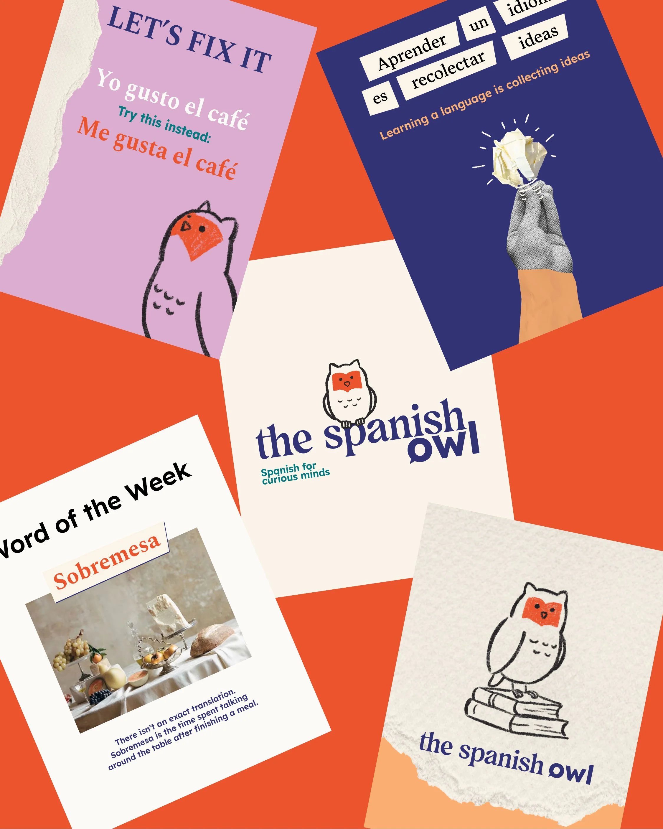
The Spanish Owl is an educational platform dedicated to teaching Spanish from a curious, cultural, and deeply human perspective. The challenge was to create an identity that moved away from the traditional aesthetic of language schools and reflected its more intellectual, editorial, and creative approach.
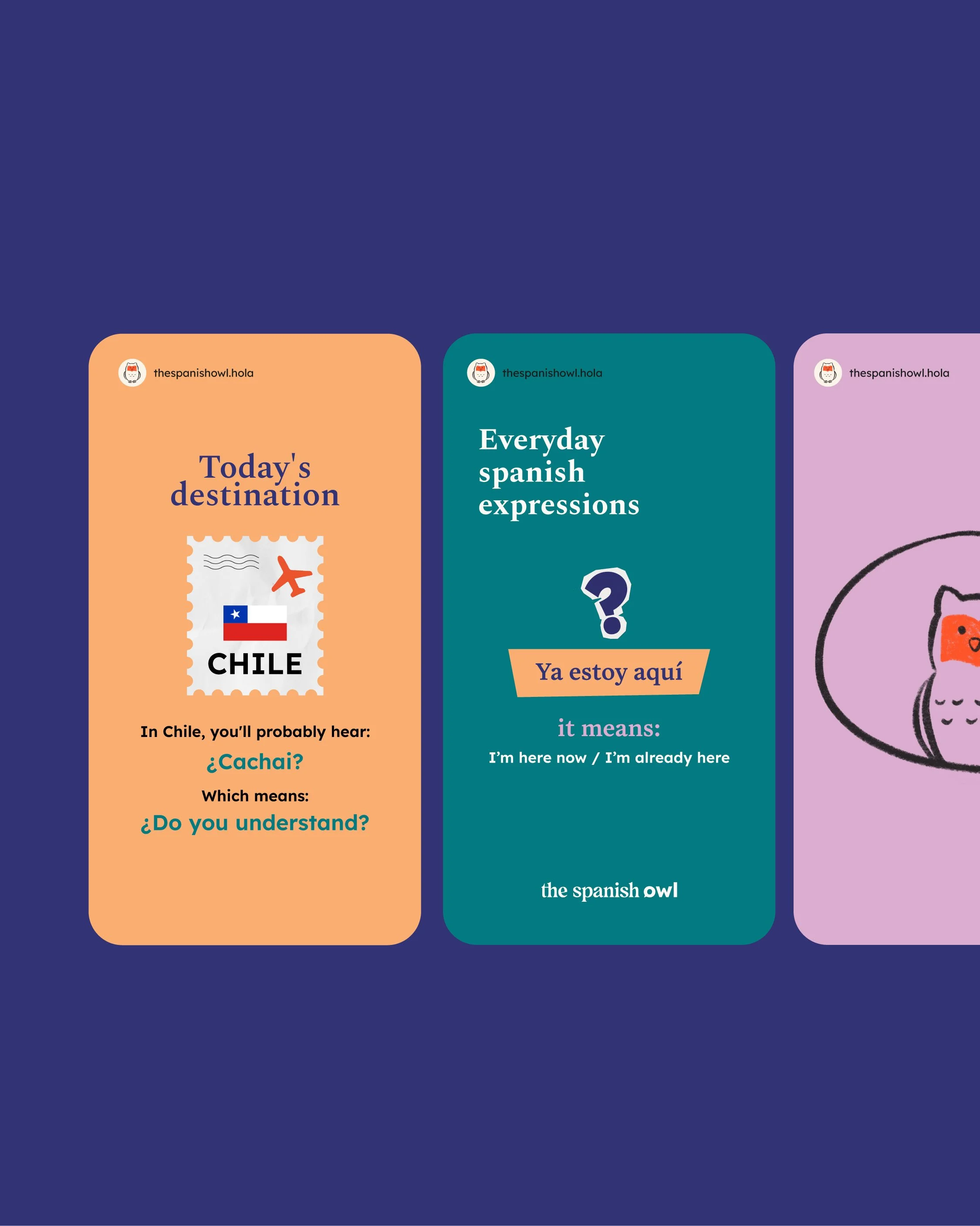
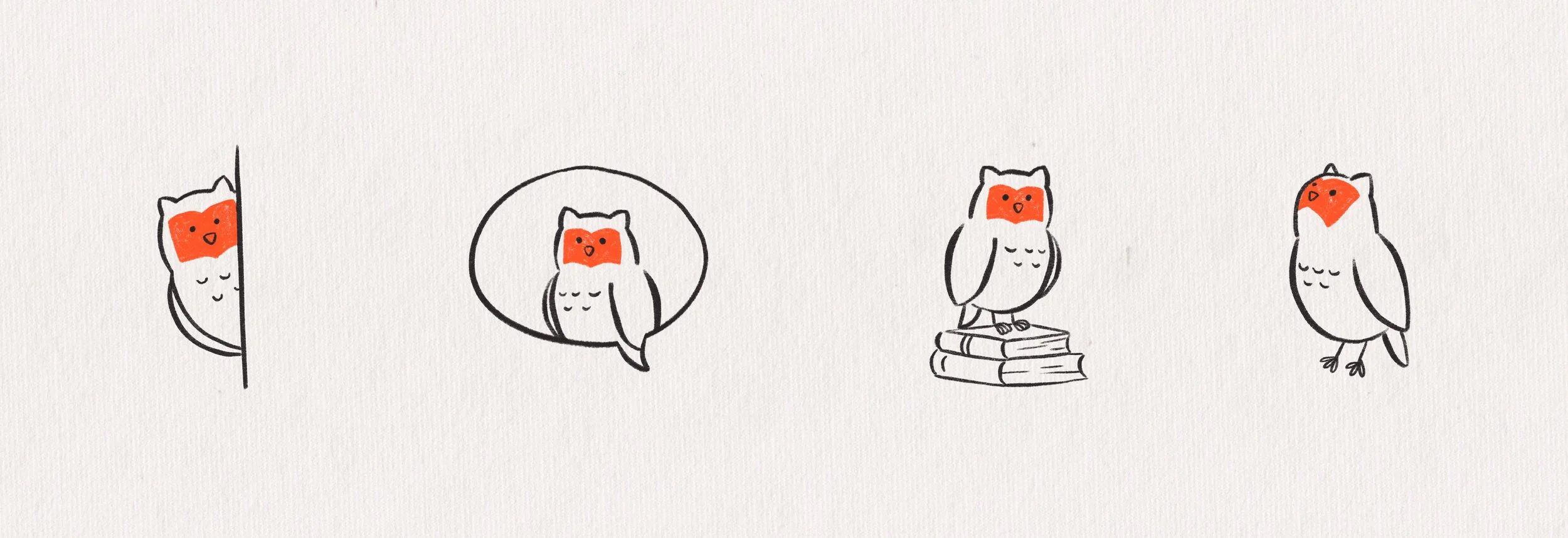
The identity combines editorial-style typefaces, a vibrant yet balanced color palette, and graphic elements inspired by collage, print publications, and study materials. The owl—a symbol of knowledge and observation—was reinterpreted using a hand-drawn, approachable style, functioning both as an isotype and as an illustrative element within the visual universe.
The result is a brand that conveys knowledge without coming across as distant, and that transforms language learning into a cultural experience that is accessible and full of curiosity.