ORUMMA
BRANDING / RRSS
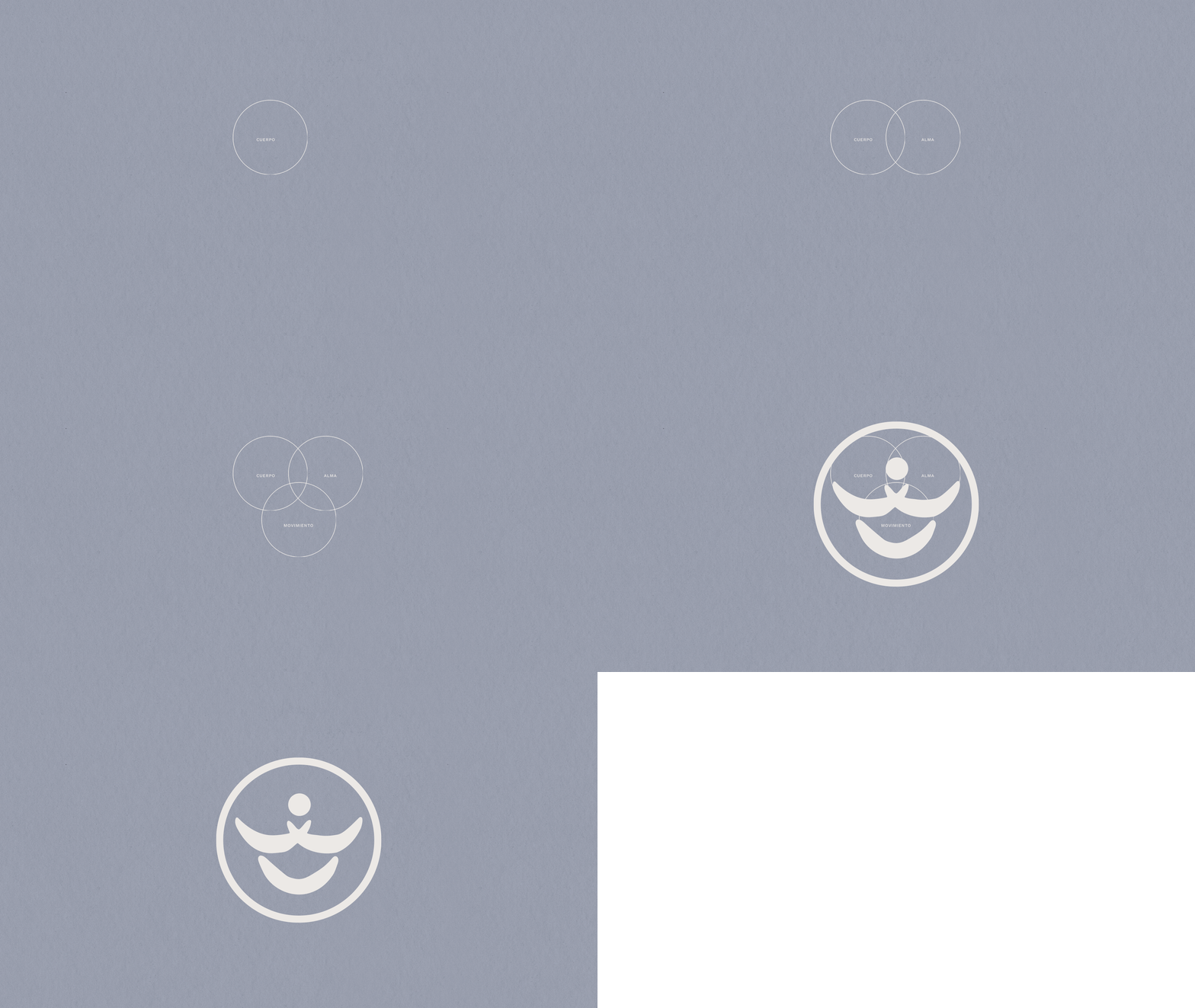
Orumma’s design stems from a clear idea: well-being arises when the body, mind, and movement are in balance. That’s why every visual decision is designed to convey calm, confidence, and warmth, without compromising professional rigor.
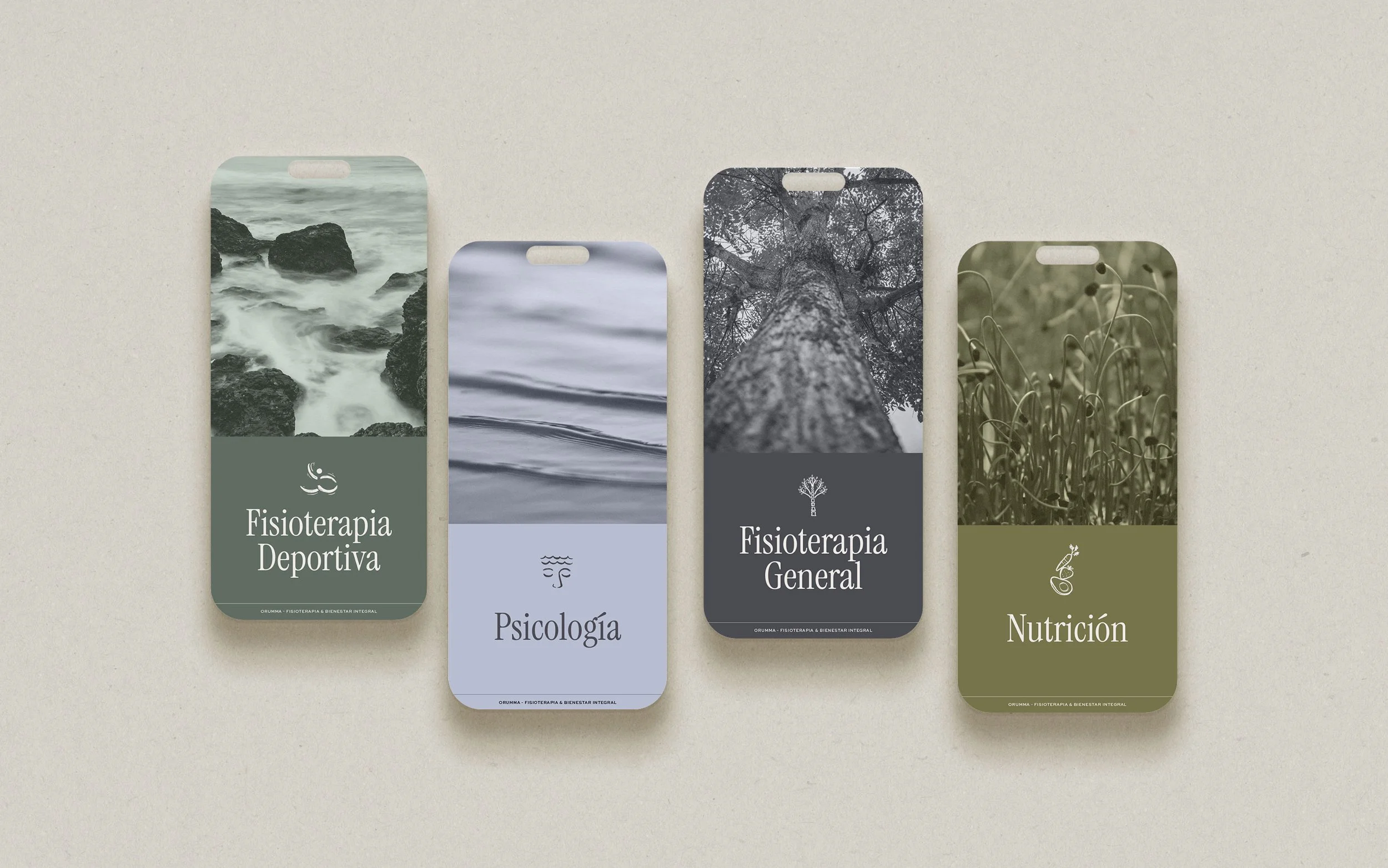
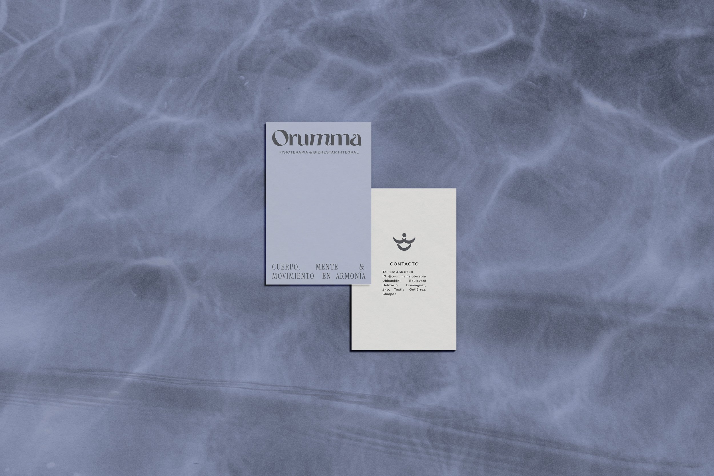
The brand identity is built around a palette of soft, natural colors inspired by fog, earth, and vegetation. These are tones that envelop, breathe, and accompany without intruding. These colors create a serene visual environment consistent with the experience offered within the center.
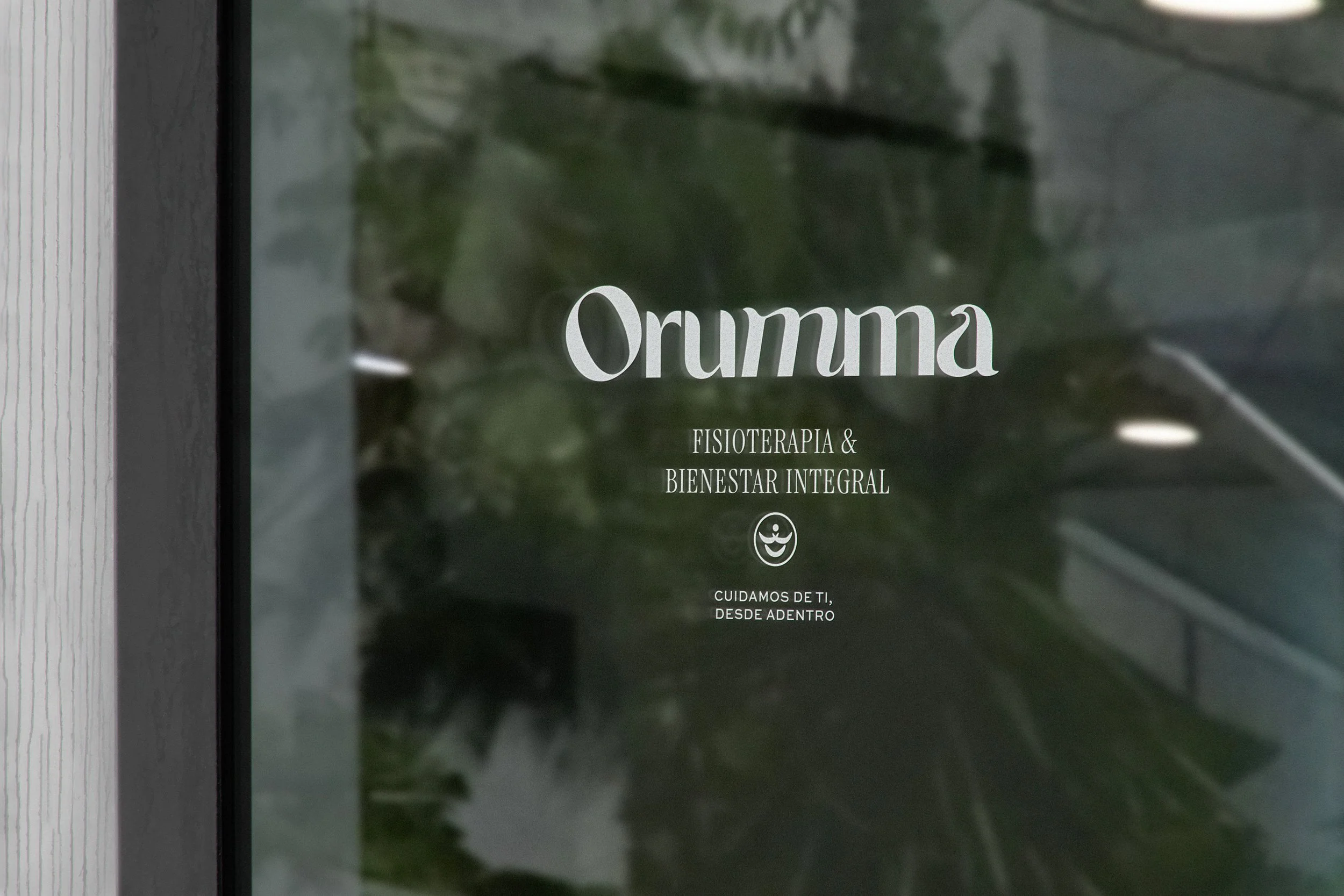
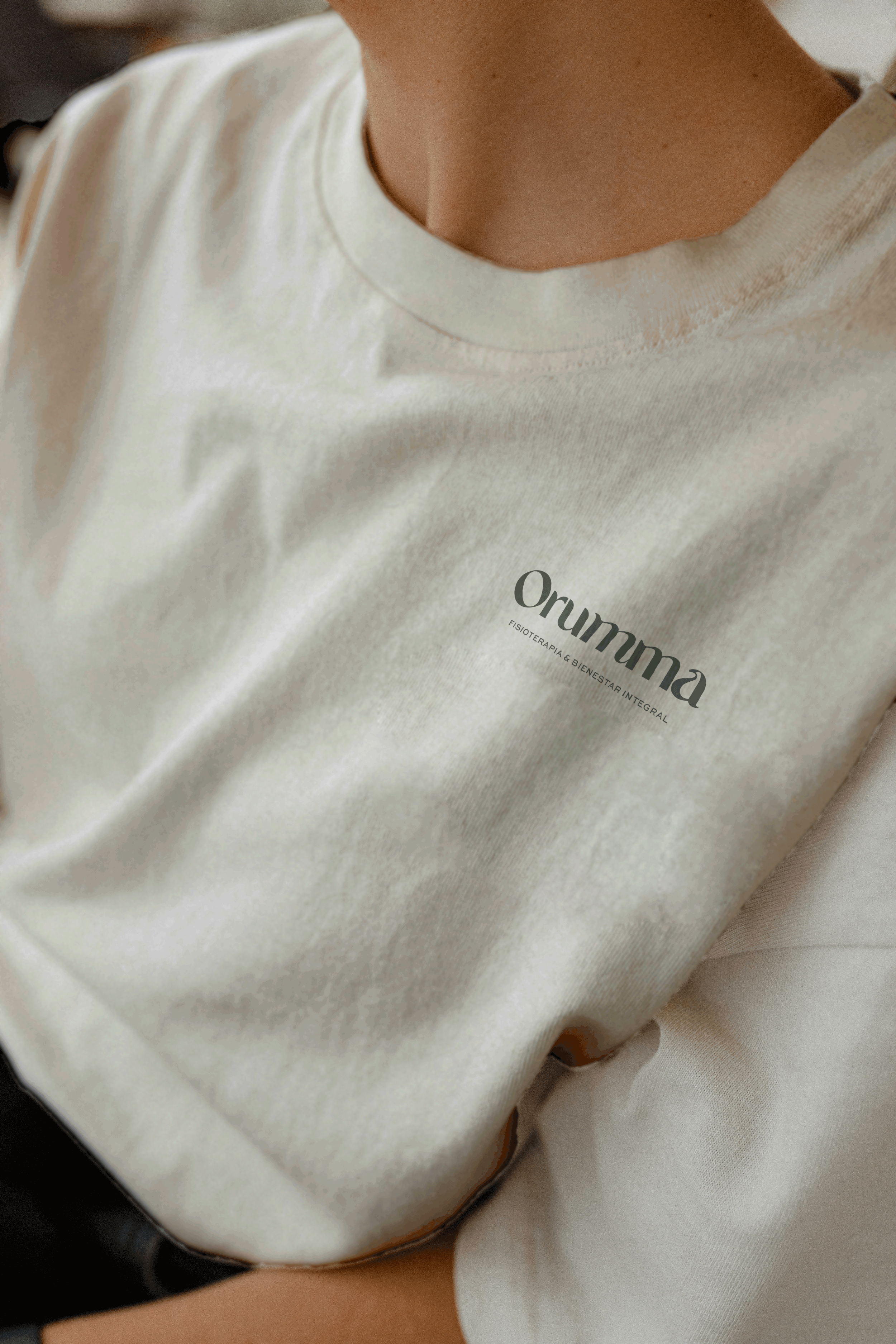
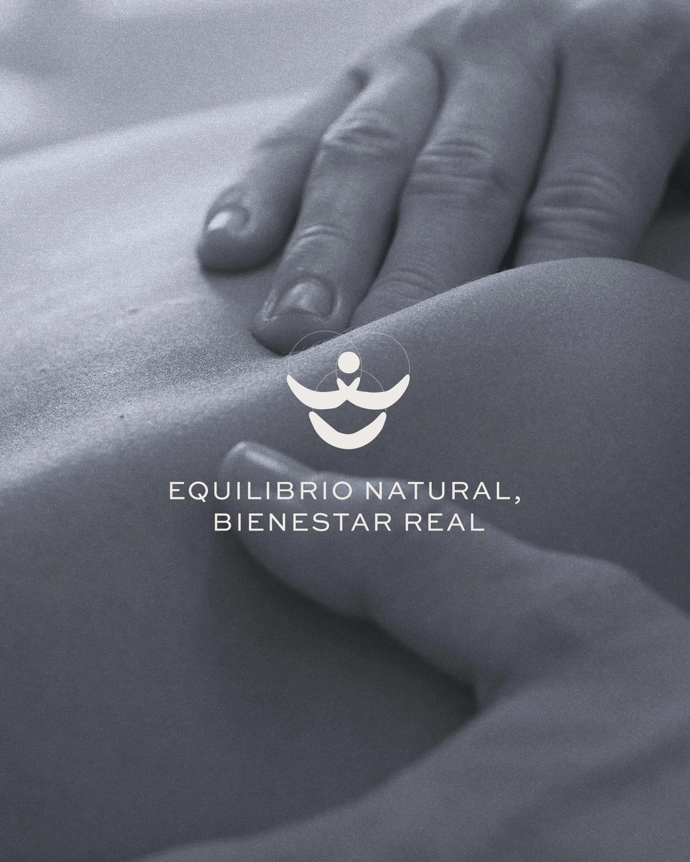
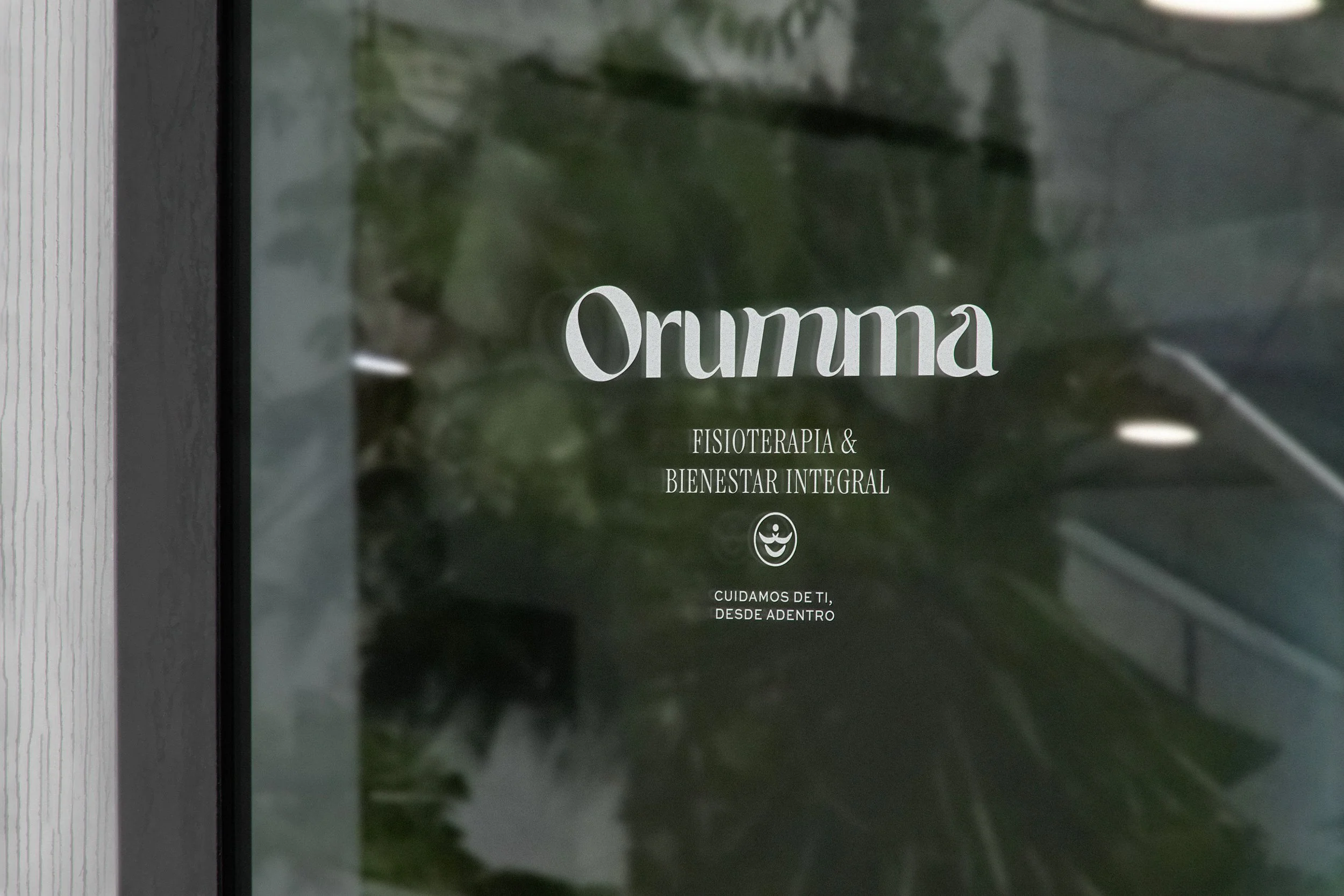
The typography combines elegance and clarity. The logo, with its fluid and organic lines, symbolizes unity and movement, while the supporting typefaces provide structure, legibility, and balance. Together, they reflect the harmony between sensitivity and professionalism.
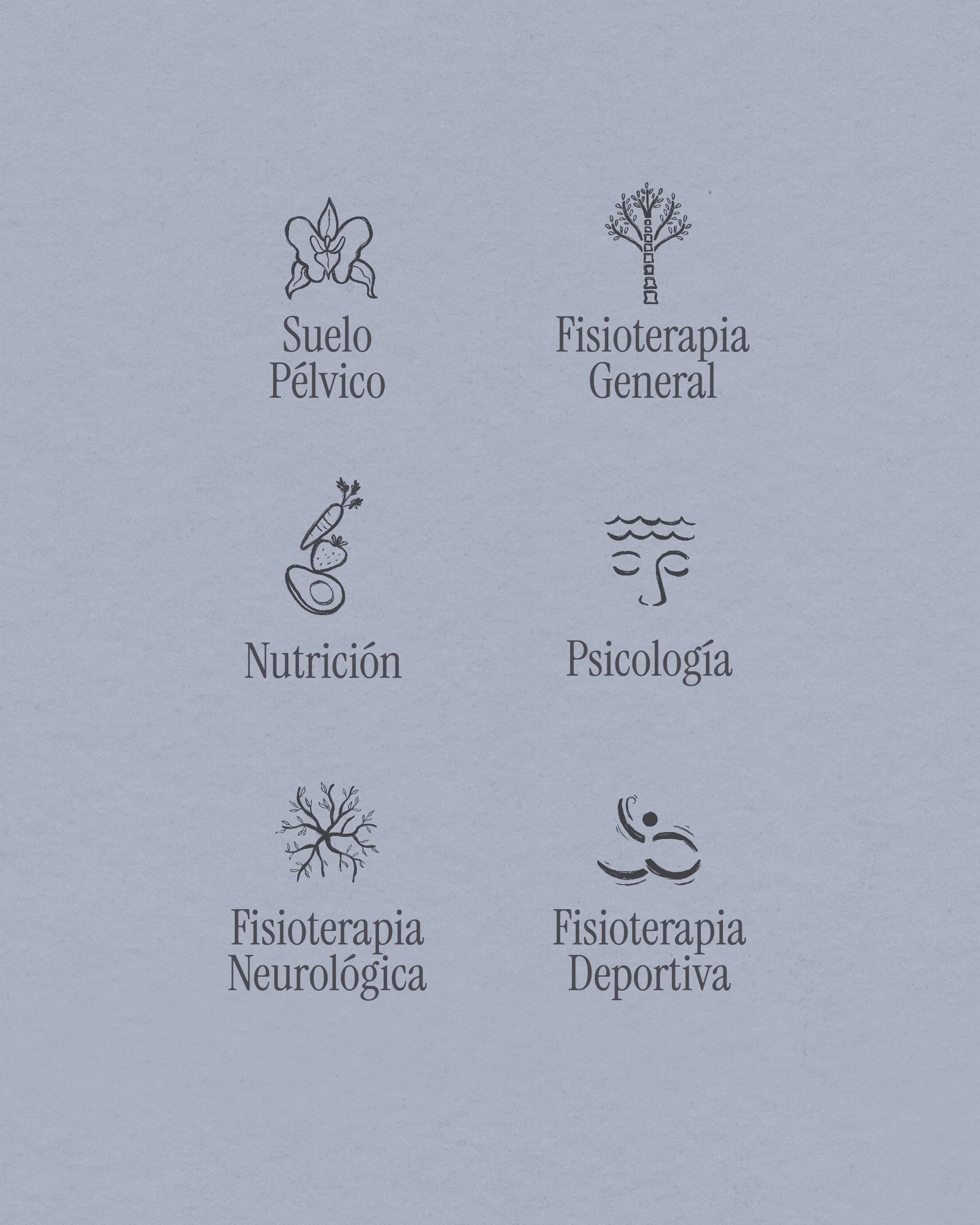
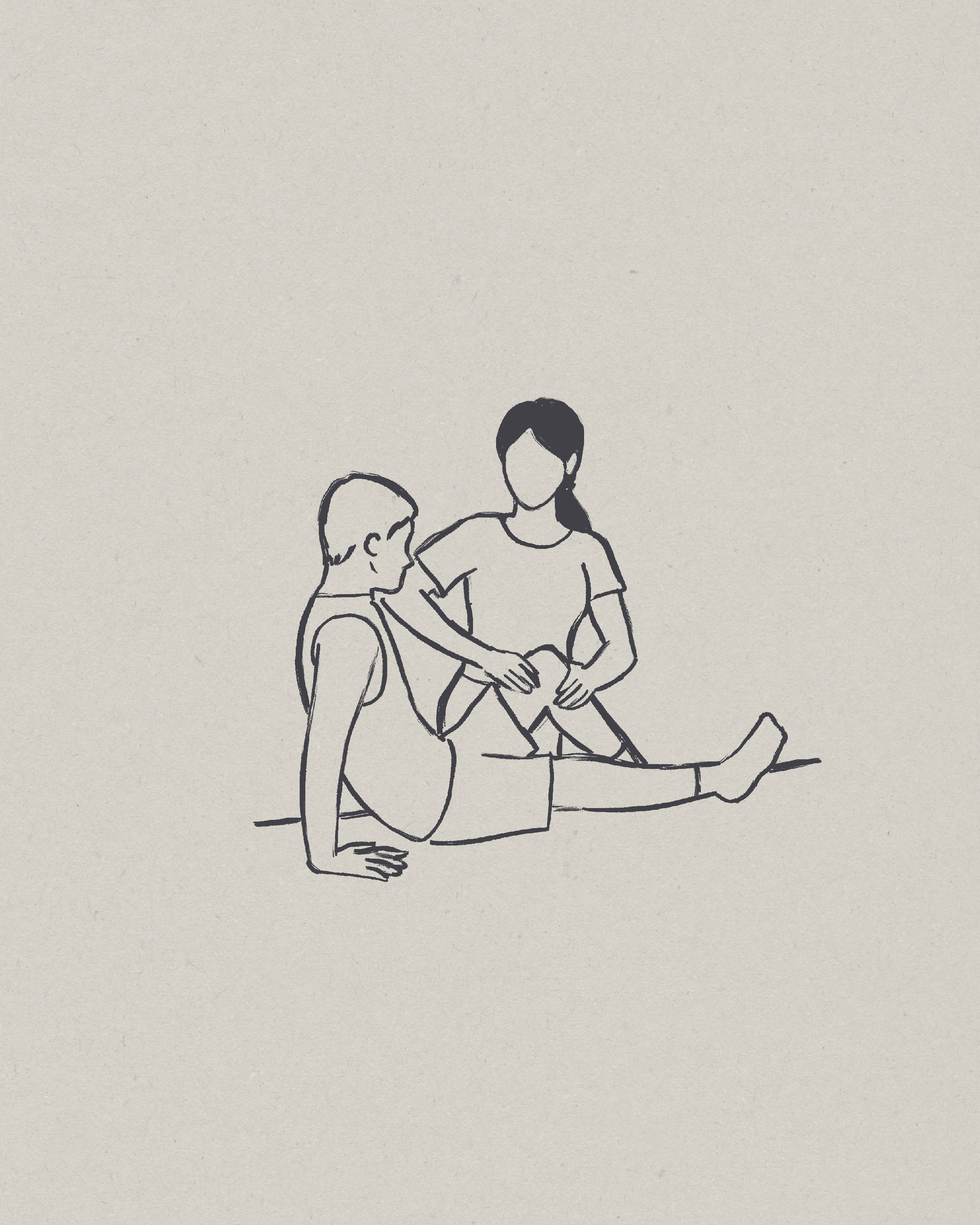
The illustrations, rendered in a Chinese ink style, connect the human body with elements of nature. Flowers, branches, water, and movement are integrated as visual metaphors for the healing process, reminding us that the body, like nature, has its own rhythm for recovery.
Overall, Orumma’s design seeks not only to look good but also to feel good. It is an identity designed to accompany, to build trust, and to communicate that here, well-being is approached with science, empathy, and calm.