IMPOSSIBLE BAKERS
PACKAGING
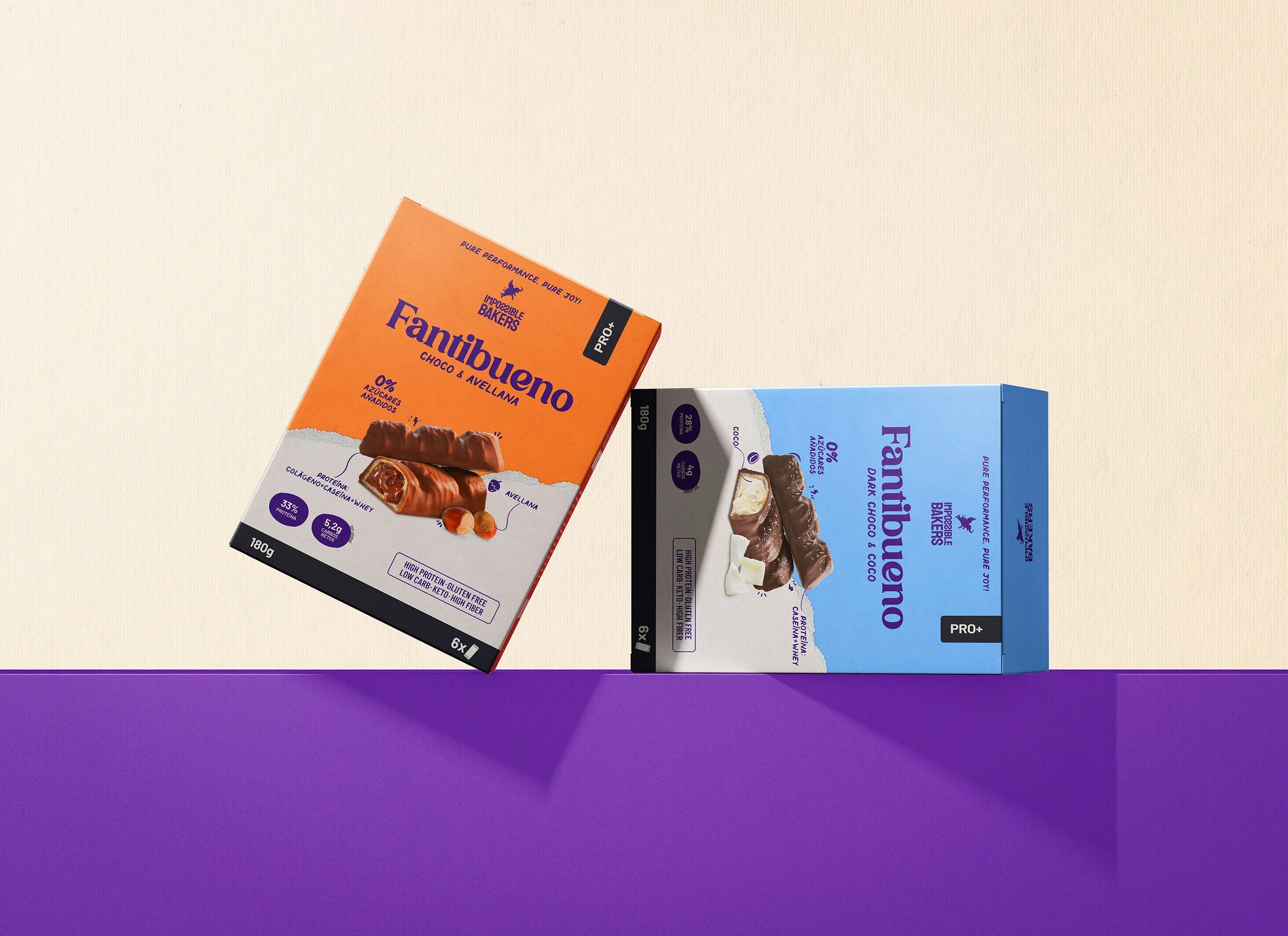
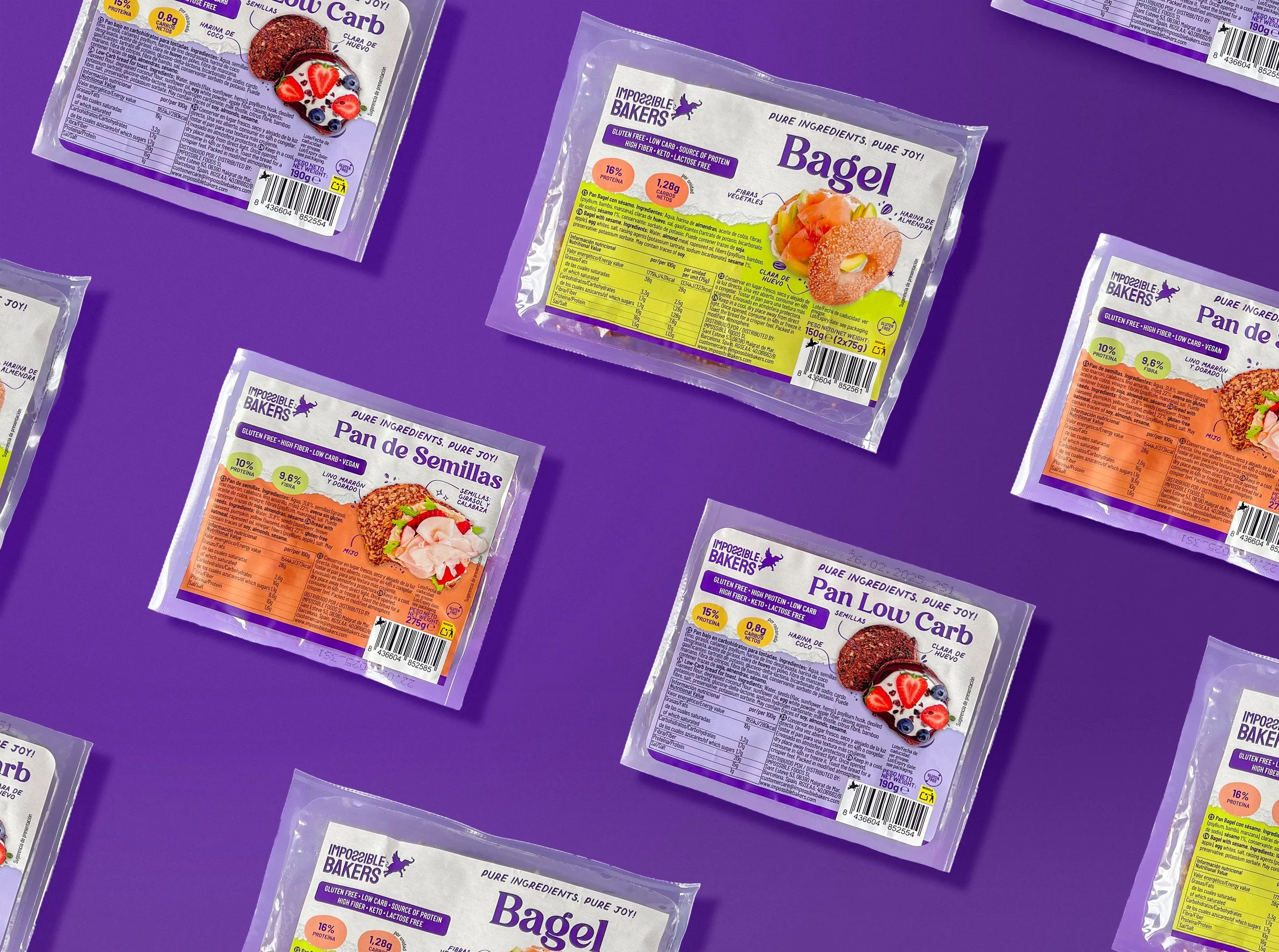
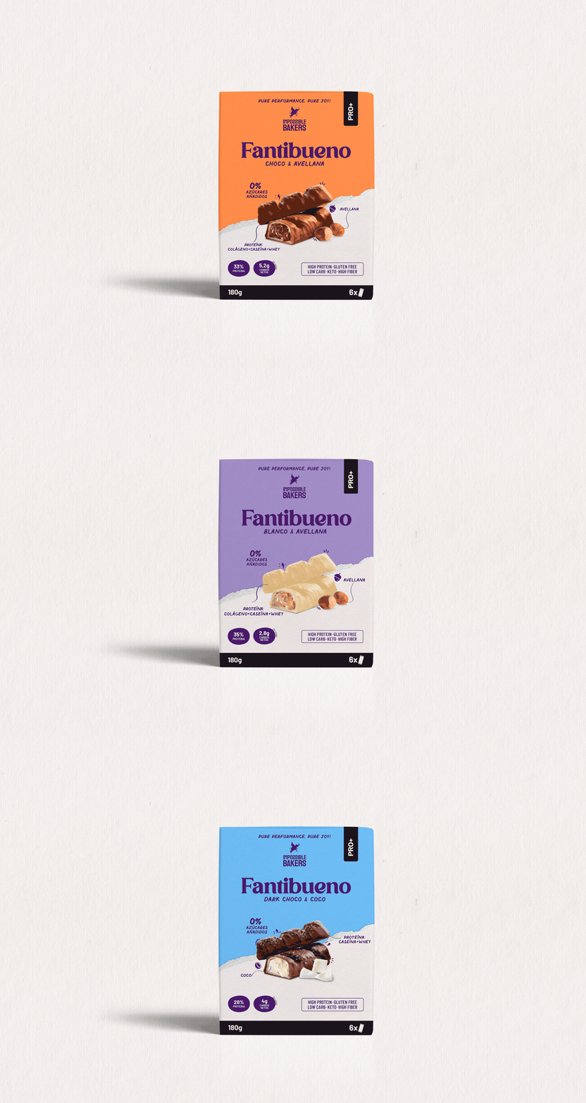
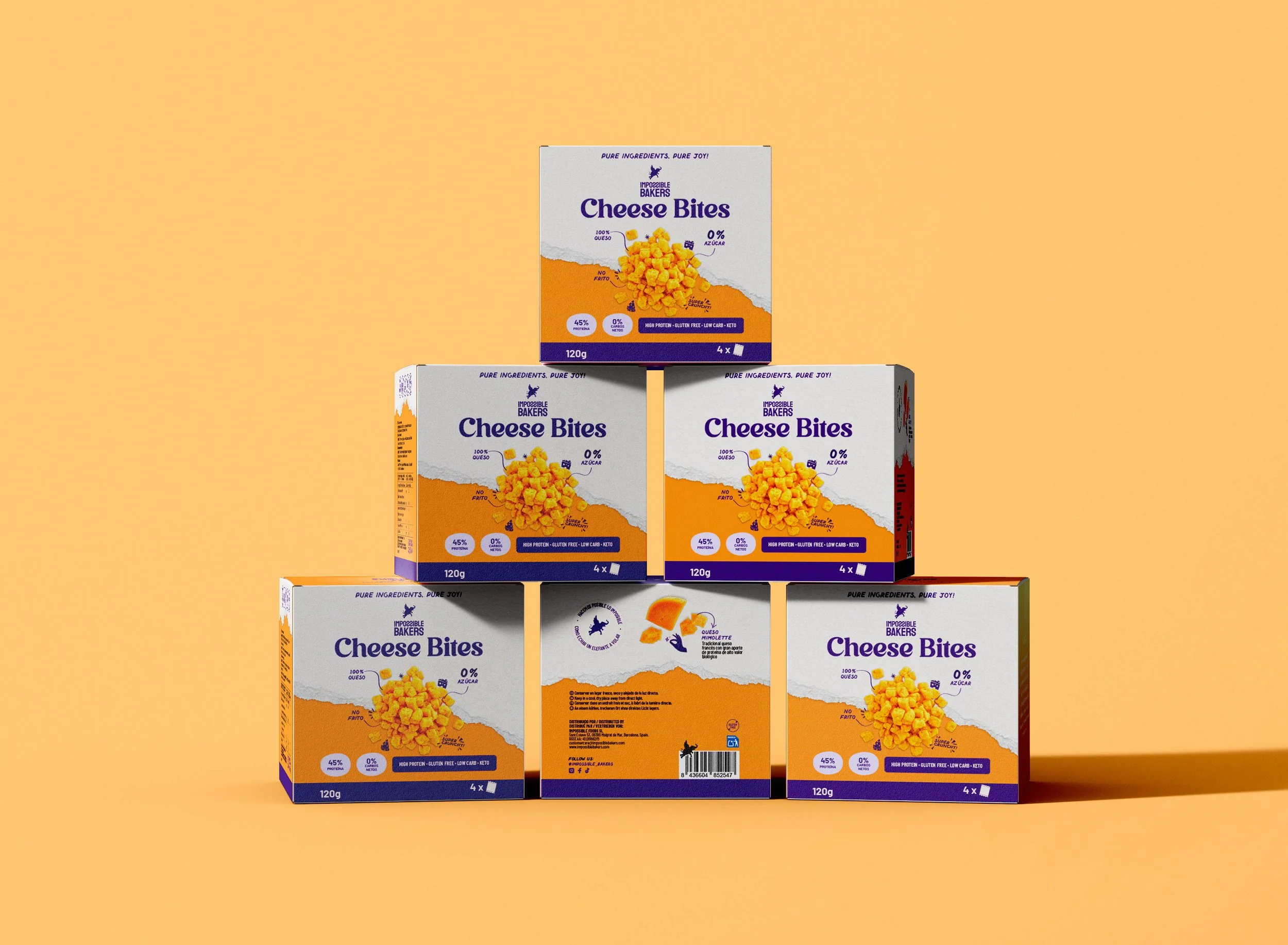
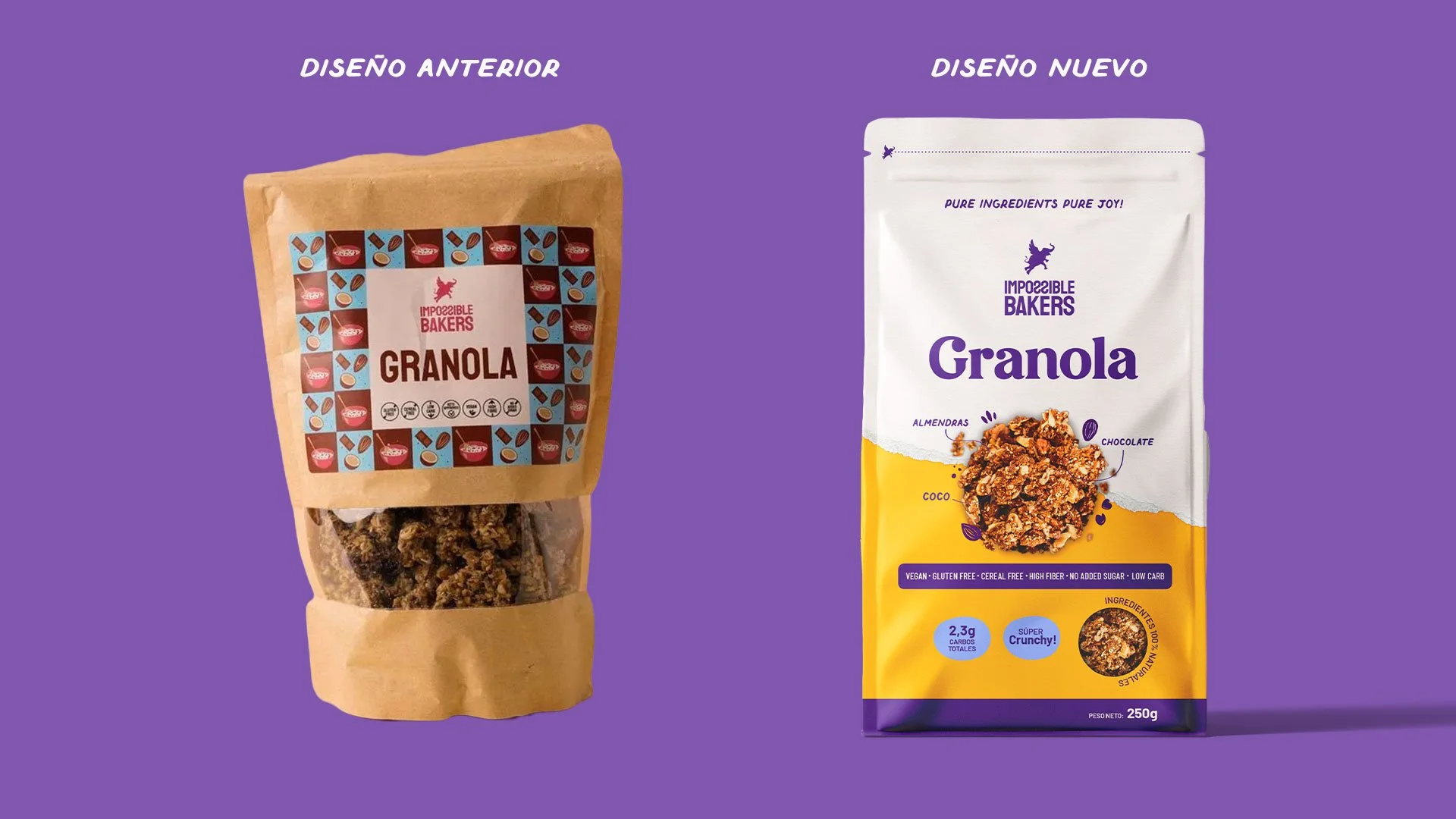
I had the opportunity to collaborate with Impossible Bakers, creating the graphic design for the packaging of all their products. The main goal was to make the products stand out on the shelf while maintaining the brand’s playful and colorful personality, but without coming across as childish.
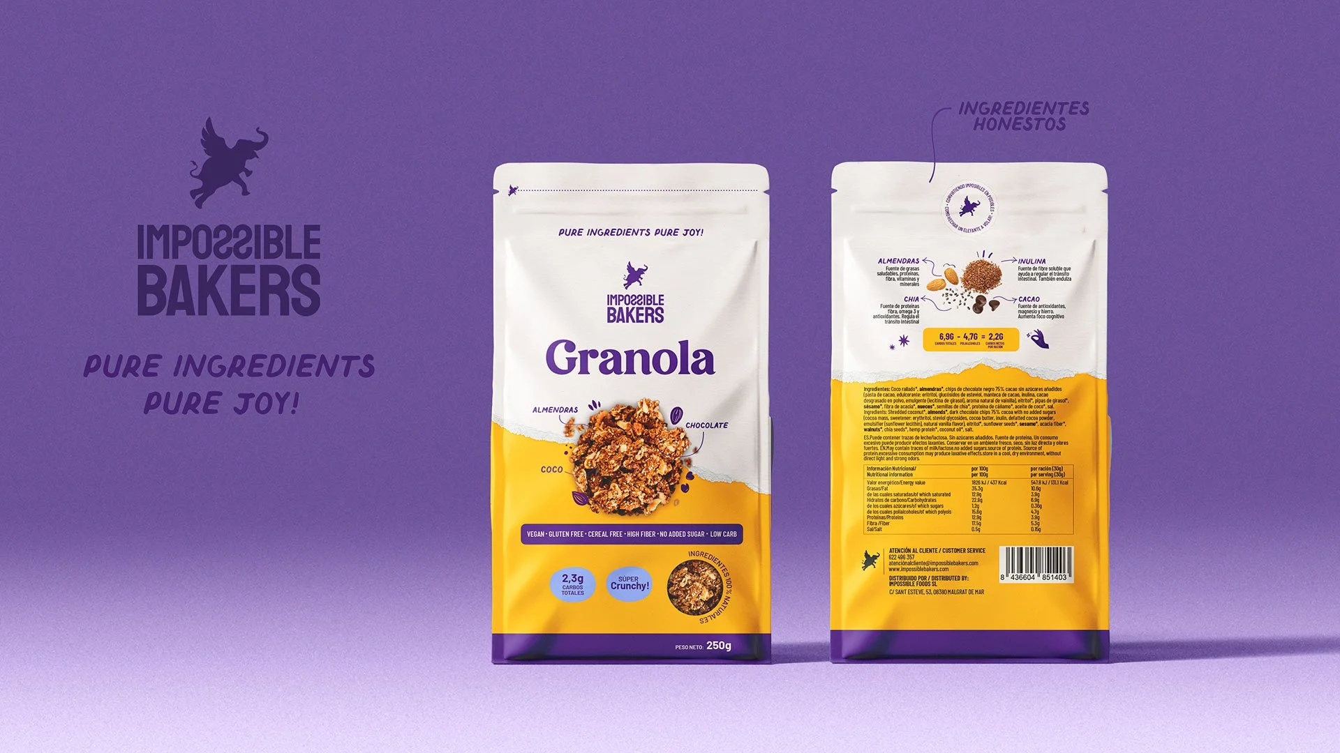
In addition to highlighting the brand’s personality, an important part of the project was making the key information for each product clearer and more accessible. I also worked to ensure that all products looked like part of the same family, united under the brand’s visual identity.
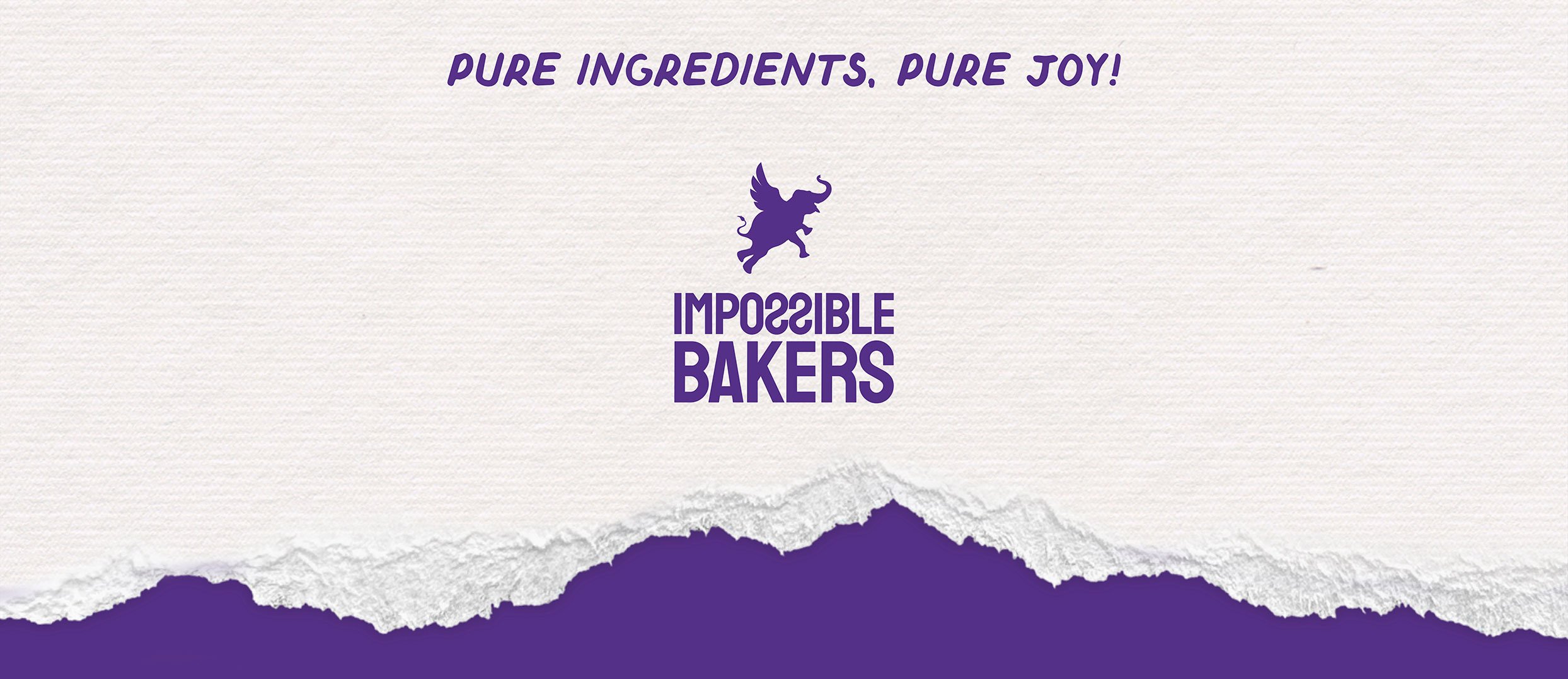
To capture that creative spirit, I used elements such as paper cutouts and a vibrant color palette, always combined with the brand’s signature purple. Each package also features doodles of the ingredients, adding a unique and fun touch.
Finally, I developed the slogan “pure ingredients, pure joy,” which highlights the brand’s transparency and its commitment to clean-label products, offering a purer and healthier experience.